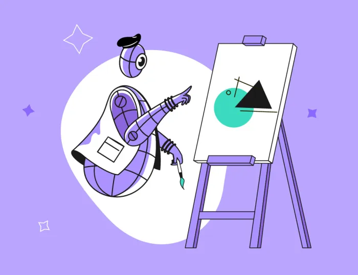
How to Add Motion to your Communication – and Keep it On-Brand
Clients often ask us: how do you create motion content that reflects a brand's image? In true consulters fashion, we answer with another question: can we take a look at your brand’s style guide?
According to our partner HubSpot, the COVID-19 crisis has accelerated the digitalization process of companies by what can only be described as a gigantic leap forward. This year, more companies are advertising their services online than ever before. Whether that be through social media channels or their own websites, one content type reigns supreme – video.
However, since video production can be quite a costly endeavour, animated graphical content, also called motion design or motion graphics, is steadily increasing in popularity. Even if a video combines real-life video content and motion graphics, the price point will still decrease as fewer production days are needed. But how do we make sure the motion content fits your brand?
1. Include motion in your corporate design manual
Visual identity systems (aka corporate design manuals) can get quite complex and comprehensive, but outside of a few very bright exceptions, the world has not quite perfected them yet. Through our discussions with our clients, we have noted that a very important section of their identity guide is often missing – the video/motion section.
It might just be a matter of time – after all, style guides were first used for print products and only gradually started to include digital communication. When it comes to laying out the video and motion design guidelines, companies are still figuring out the best way.
There’s no “best practice” to rely on here, but there are a few simple things to consider when including motion in your communication. So, let’s get into it.
2. Think about what the animations should feel like
Much like picking a color palette, you have a lot of freedom to choose an appropriate animation style, but you need to be careful that the motion “feels” right. Indeed, animation is all about feeling. You wouldn’t want a company that sells energy drinks to have the same sort of animation as a hedge fund, would you?
Just like energy drinks aren’t being labeled as “calm and resilient”, a hedge fund based on the slogan “GO WILD OR GO HOME!” would probably not entice too many individuals to bet their future on them.
This sort of reasoning can directly be applied when crafting the animated pieces as well. For example, if your company stands for trustworthy, calculated and intelligent services, you should probably focus on making your animation smooth, clean and moving at just the right pace to make someone feel at ease, all while giving them enough time to see and comprehend all of the moving pieces.
Keeping this in mind, let’s take a look at the specific situations where this could be applied.
3. Start out with some basic animated elements
Although there are as many types of motion content as there are genres in the movie or music industry, the easiest few to focus your branding efforts on are: logo animations, overlays, lower thirds and explainer videos.
Logo animations
Logo animations are probably the first type of animated content you should create for your company. Extremely useful for starting or ending a video, animated logos are the most important type of content where the feel of the animation should quite literally cling to your brand’s core values. See if you can find a way to set your brand’s mission and beliefs into motion.
Overlays
Overlays refer to graphical elements placed on top real-life video content. Overlays are most often used when you want to attract attention to specific parts of the shot, or when you want to add additional explanations to the content. There is really no limit to whether the overlays are simple or complex, whether they are an integral part of the shot or covering part of it, but you should always keep your brand in mind when crafting them. The animation, as well as the graphics, should reflect your brand’s messaging, color palette and graphical guidelines.
Lower thirds
Lower thirds are actually a sub-type of overlays, but since they are becoming one of the hallmarks of the brand’s identity design, we wanted to give them extra attention. The term comes from broadcasting jargon and refers to animated graphics mostly found in the lower third of the screen. The most common type of lower thirds is an introductory graphic of the current speaker, revealing his name, surname and function. Naturally, they can also indicate the switching of topics or other information. Regardless of their function, this is a great example of where you can set up an appropriately branded template for both the graphics and the animation.
Explainer videos
Explainer videos are an increasingly popular solution for explaining the nitty-gritty of your company’s brand or service to the general population. Even the most complicated topics, such as quantum particles, can be explained with the help of some well-designed graphics and texts that are brought to life by animation. Explainers can, potentially, be the hardest type of content to keep on-brand. The best thing you can do is to really keep your color palette in mind, while also designing the graphical worlds in a way that is still on-brand. Brands that set their visual identity guides in a more illustrative style definitely have an advantage here.
4. Look for inspiration
Since we barely scratched the surface of animated content, you might still be wondering who, and if anyone, actually has a proper identity guide.
The answer is yes and actually right in front of us, yet very hard to see, since we mostly consume that type of content to relax. We are, of course, talking about brands like Netflix or HBO. Have you ever noticed how not just the platform, but the trailers and the announcements always use the same visual and motion guidelines? If we showed you an “up next” insert from HBO, you would surely not confuse it with Netflix, despite them both focusing on a rather dark visual theme overall. Much like you would never mistake Netflix’s signature sound effect when it reveals it’s logo, for a part of HBO branding.
There are many other brands that could be set as examples, we must only look to the fields that have engaged with this problem for years. Fields such as the entire world of broadcasting, especially news networks, or on-demand video content platforms such as YouTube and others. Just keep your eyes open for good examples of motion design and get inspired.