The 5 core elements of branding
Brand design makes the personality and values of a brand come alive. Its visual features set a brand apart from its competition and increase awareness. Ultimately, it’s what makes the brand memorable.
Contribution by Franziska Ullrich, User Experience Designer
1. Brand attributes
Before anything else, it’s important to get to know the company in depth. Analyses of competitors, markets and target groups help to position the brand. They help determine the branding goals: How should the brand be perceived by the public and internally in the company? The specific brand attributes that emerge from these analyses shape all further steps of brand design. All elements of branding, such as typography, colour and image selection, are developed on the basis of these attributes. Through their consistent use on all communication channels, the brand is perceived as trustworthy and associated with high quality.
Design is the silent ambassador of your brand.
2. Colours
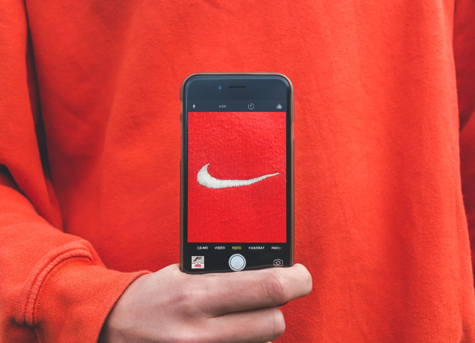
Colours can enhance the distinctiveness and positioning of the brand. When Swiss people see the color orange, they immediately think of Switzerland's largest retail company Migros. If the brand attributes say the brand should feel bold and dynamic, a pastel colour palette would probably not be the right choice. Color psychology has long been studying the significance of colours and their effect on us. We perceive some colour combinations as more harmonious than others because of the colour receptors in our eyes. When a combination appeals to all three receptors at the same time, we find it particularly harmonious. Colours can also evoke feelings: Red is the color we associate with love, but we also perceive it as aggressive. The associations often result from our cultural background and can be perceived completely differently somewhere else.
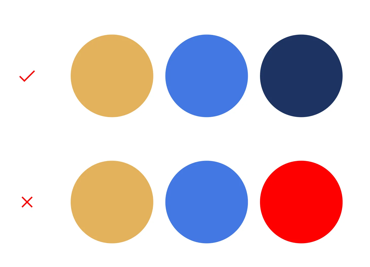
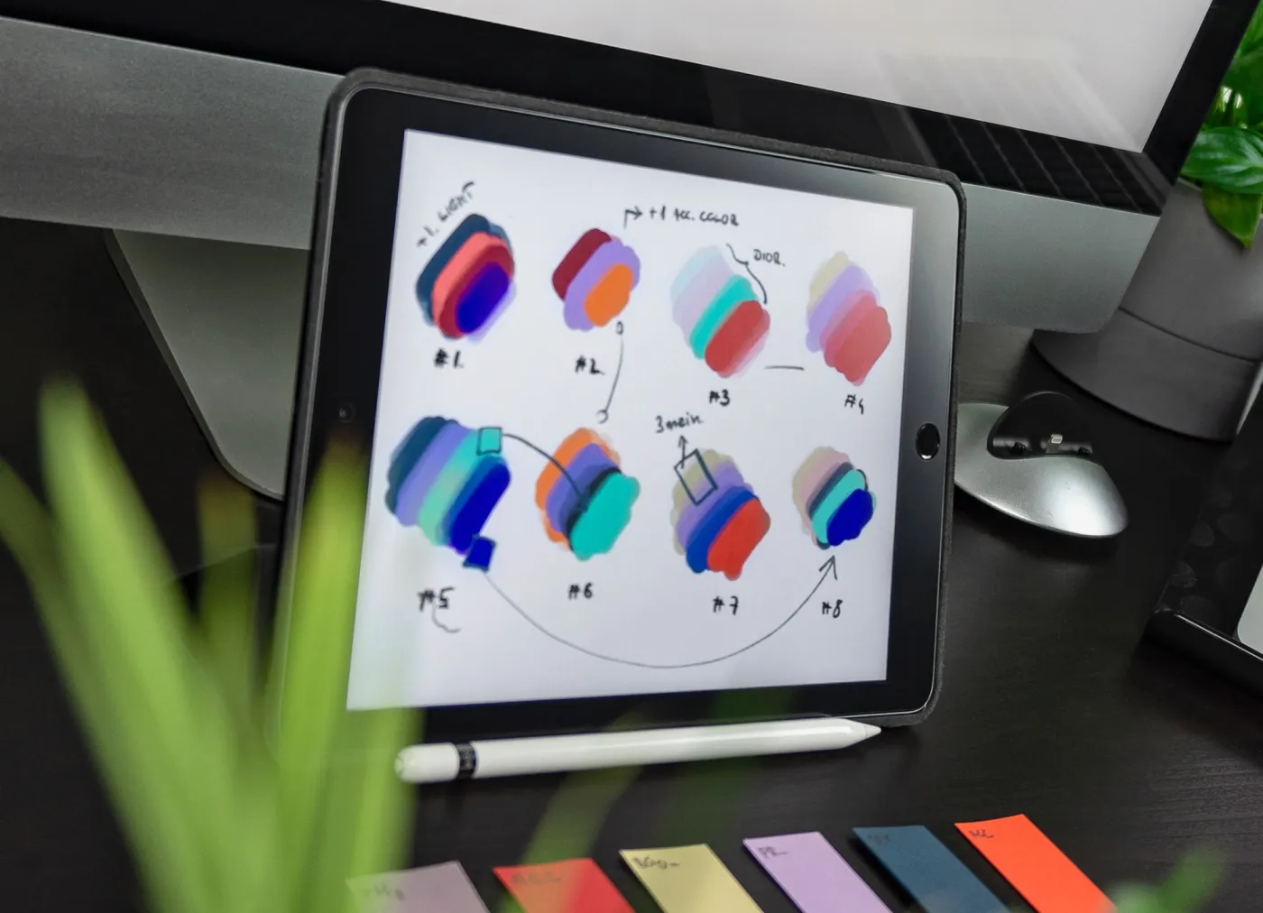
Depending on the desired effect, choose a harmonious color palette - or one whose striking contrasts catch the eye.
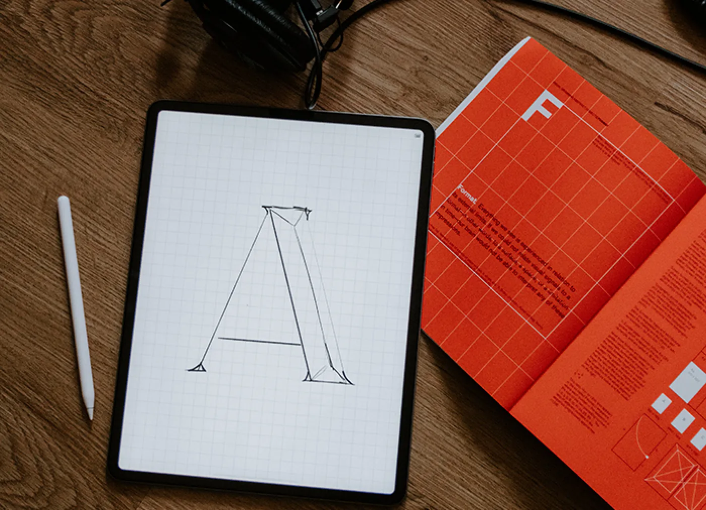
3. Typografie
Typography is a huge topic with a very long history. Even King Louis XIV wanted the state’s print products to appear unique, and thus commissioned the design of a new typeface called "Romain du Roi" for the royal printing press. Today, despite the availability of uncountable free fonts, some brands still choose to design and develop their own house fonts or to personalise existing fonts through detailed adaptations.
If you can't read it, it sucks.
First and foremost, however, typography has to do one thing: convey information. Be it in digital or print: you need to be able to easily read a good typeface from up close and from afar. By combining different fonts, the design possibilities with typeface become endless. However, there are a few rules to be observed here. The fonts should contrast well with each other and the paired typefaces should never look too similar.
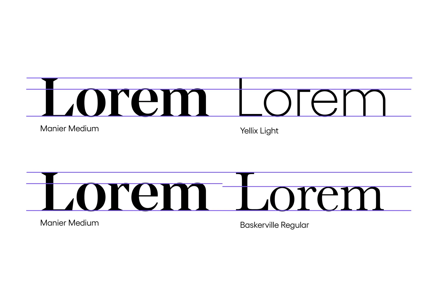
We use the serif font Manier for titles and quotes and the simpler sans-serif Yellix for long texts.
4. Imagery
When you are offered a Marlboro cigarette, what do you immediately think of? Cowboys, wild galloping horses, the vastness of the prairie – boundless freedom. Images have a more immediate and intense effect on us than text. They evoke specific feelings and transport a message at the same time. If the images are well chosen, they can have a great effect and help in creating a connection to the brand. Consistent and recognisable imagery is often defined by technical characteristics such as exposure, depth of field, colour, light, perspective and composition. And of course: by what is depicted in the image.
5. Key Visuals
When graphic elements or key visuals are used, they should always have a real purpose and support the brand attributes. They can highlight different areas of a layout and guide the eye. Absolut Vodka, for example, has used the iconic bottle shape of its products as a key visual for decades. By consistently using these key visuals, it is now possible for them to do without the brand name in their communication. The key visual is recognizable enough. Ultimately, key visuals are patterns. We have the ability to remember patterns, to recognise them and to decipher them. If the key visuals are used consistently, visual communication is associated with the brand more effectively and more successfully.
Fazit
Brand design is an interplay of many visual details. If the core elements are chosen to match the brand attributes and play well together, the brand is strengthened and will be remembered. Consistency is important, because it is the only way to establish a brand in the long term.